
by Mara Tate
Welcome to our online gallery. The artwork here is by students at Rowe Junior High School in Athens, PA.
I've never made altered books before, but my ninth grade art students and I are learning together. The Waverly Library had several boxes of books that were headed for recycling. We offered to recycle them -- into art! Students have shown a lot of creativity in coming up with their own creative solutions in transforming books into art.
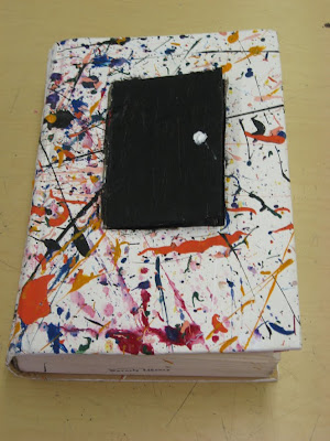
 What is an altered book?
An altered book is a form of mixed media artwork that changes a book from its original form into a different form, altering its appearance and/or meaning.
An altered book artist takes a book (old, new, recycled or multiple) and cuts, tears, glues, burns, folds, paints, adds to, collages, rebinds, gold-leafs, creates pop-ups, rubber-stamps, drills, bolts, and/or be-ribbons it. The artist may add pockets and niches to hold tags, rocks, ephemera, or other three-dimensional objects. Some change the shape of the book, or use multiple books in the creation of the finished piece of art.
Altered books may be as simple as adding a drawing or text to a page, or as complex as creating an intricate book sculpture. (Wikipedia, 2010).
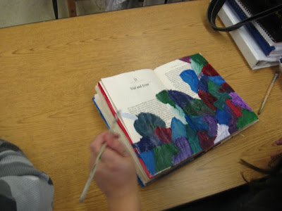
 If you are interested in seeing a gallery of work by artists who specialize in altared books, visit this website: www.altaredbookartists.com
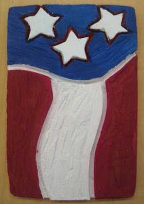 Kirsten Colegrove
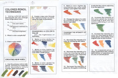 Art I classes are finishing up colored pencil drawings. Students completed graphic organizers demonstrating their understanding of colored pencil techniques. These exercises are from The Colored Pencil: Key Concepts for Handling the Medium (Borgeson, 1983). We are learning that artists can change three things about a color: hue (a color's name), value (the lightness or darkness of a color) and intensity (purity or brightness of a color).
 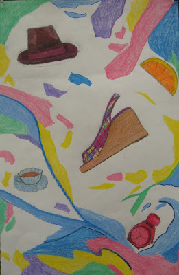 Stepping Out
 Rainbow Bouquet
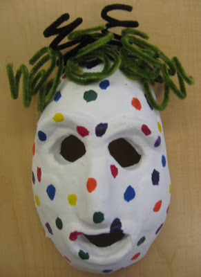 8th grade art clases made masks out of clay. After we fired them, they had the choice to either paint them or glaze them. After adding color, some added texture and detail by gluing various material to it with a glue gun.
 The masks have been fired. Now they are ready to glaze and paint. As eighth graders have been patiently waiting, they made some great anti-bullying posters to hang in the hallway. Some of these kids really "get it" -- and made some great posters that get the message across, and make us laugh at the same time.


